In today’s digital age, mobile devices have become an integral part of our lives. With the rapid advancements in technology and the increasing reliance on smartphones and tablets, optimizing websites for mobile users has never been more crucial. In 2025, Mobile SEO Optimization (Search Engine Optimization) continues to play a pivotal role in determining a website’s visibility and success in search engine rankings.
As the number of mobile users surges globally, search engines like Google have prioritized mobile-friendly websites in their algorithms. This means that websites that offer a seamless and responsive mobile experience are more likely to rank higher in search results, driving increased traffic and engagement. To ensure your website stays ahead in this competitive digital landscape, here are some essential strategies to optimize for mobile users in 2025:
Table of Contents

Mobile-First Indexing for Mobile SEO Optimization
Mobile-First Indexing is a fundamental shift in how search engines like Google index and rank websites. It signifies a move towards prioritizing the mobile version of a website’s content over its desktop version when determining search engine rankings.
In the past, Google primarily used the desktop version of a site’s content to evaluate its relevance and assign rankings in search results. However, considering the significant shift in user behavior towards mobile devices, Google recognized the need to adapt its indexing process. As a result, Google started to predominantly use the mobile version of a website for indexing and ranking purposes, hence the term “Mobile-First Indexing.”
This approach acknowledges the growing importance of mobile devices in accessing the internet. With more users relying on smartphones and tablets to browse websites, it became crucial to ensure that the mobile experience offered by a website is as seamless, informative, and functional as its desktop counterpart.
For website owners and developers, Mobile-First Indexing necessitates a mobile-responsive design. It’s no longer sufficient for a website to merely have a desktop version that is then adapted for mobile screens. Instead, the emphasis is on creating a website that is inherently designed with mobile users in mind.
A responsive web design ensures that the website’s layout, content, and functionalities automatically adjust and display optimally across a spectrum of devices, including smartphones, tablets, and desktop computers. This means that the same content and information are available on both desktop and mobile versions, providing a consistent user experience regardless of the device used.
Website owners must ensure that the mobile version of their site contains all the valuable content, images, videos, and structured data present on the desktop version. This includes text, metadata, alt tags for images, and any other crucial information that helps search engines understand the context and relevance of the site’s content.
By adopting a Mobile-First approach, websites can potentially improve their search engine rankings, as Google predominantly evaluates the mobile version of a site when determining its position in search results. It also aligns with the user-centric approach, prioritizing websites that cater well to the ever-increasing mobile user base.
In essence, Mobile-First Indexing underscores the importance of optimizing websites for mobile devices, ensuring they provide a seamless and high-quality user experience. Adhering to Mobile-First principles not only aligns with Google’s indexing preferences but also ensures that websites are equipped to meet the needs of the growing mobile audience, ultimately enhancing their visibility and relevance in search engine results.
Page Loading Speed for Mobile SEO Optimization:
Page loading speed is a critical factor in Mobile SEO optimization, significantly influencing user experience and search engine rankings. In the digital landscape of 2025, where mobile devices dominate internet access, users expect instant access to information. As a result, optimizing page loading speed for mobile devices has become paramount for website success.
Page loading speed refers to the time it takes for a webpage to fully display its content after a user clicks on a link or enters a URL. It is a crucial aspect of user experience as it directly impacts engagement, bounce rates, and conversion rates. Slow-loading pages frustrate users and prompt them to abandon a site, negatively affecting a website’s performance and SEO.
In the context of Mobile SEO optimization, where users are often on the go and relying on varying network connections, ensuring swift loading times is crucial. Google, in its quest to enhance user experience, considers page loading speed as a ranking factor, particularly for mobile searches. Therefore, improving the loading speed of mobile pages can positively impact a website’s visibility in search engine results.
Mobile-Friendly Design of Mobile SEO Optimization:
Mobile-friendly design, an integral aspect of Mobile SEO optimization in 2025, refers to the creation of websites that provide an exceptional user experience on mobile devices. With the exponential growth in mobile internet usage, catering to the needs and preferences of mobile users has become imperative for website success and search engine visibility.
Mobile-friendly design encompasses various principles and techniques aimed at ensuring that websites are easily accessible, visually appealing, and fully functional across a spectrum of mobile devices, including smartphones and tablets. Here are key strategies to achieve mobile-friendly design for Mobile SEO Optimization:
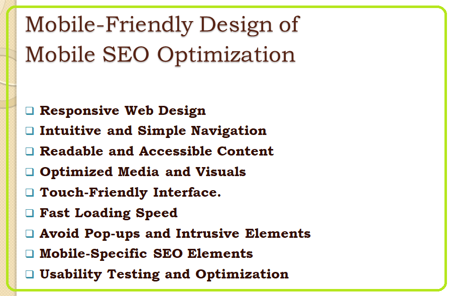
Responsive Web Design: Adopting a responsive web design approach is crucial. This technique allows websites to adapt seamlessly to different screen sizes and resolutions, ensuring that content, images, and page elements adjust fluidly to provide an optimal viewing experience. Responsive design eliminates the need for multiple versions of a website for different devices, enhancing efficiency and consistency.
Intuitive and Simple Navigation: Simplify navigation for mobile users by implementing clear and easy-to-use menus, navigation bars, and search functionalities. Condense menus into collapsible or expandable formats (e.g., hamburger menus) to save screen space and enhance user interaction.
Readable and Accessible Content: Optimize content for mobile devices by using readable font sizes, clear typography, and adequate spacing between elements. Break content into smaller, digestible chunks, incorporate bullet points, and avoid large blocks of text to enhance readability on smaller screens.
Optimized Media and Visuals: Ensure images, videos, and other media elements are optimized for mobile devices. Compress images without compromising quality, use appropriate file formats, and consider lazy loading techniques to prioritize content visibility while improving loading times.
Touch-Friendly Interface: Design website elements, buttons, and links with touchscreens in mind. Ensure they are adequately sized and spaced to prevent misclicks or frustration while navigating the site on mobile devices.
Fast Loading Speed: Reiterating the importance of page loading speed, a mobile-friendly design should prioritize quick loading times. Implement strategies like minimizing server requests, optimizing code, and leveraging browser caching to enhance speed.
Avoid Pop-ups and Intrusive Elements: Intrusive pop-ups and interstitials that disrupt user experience on mobile devices should be minimized or avoided altogether. If necessary, use non-intrusive methods for notifications or calls-to-action.
Mobile-Specific SEO Elements: Implement mobile-specific SEO elements such as mobile-optimized meta tags, titles, and descriptions. Ensure that structured data markup is correctly implemented for enhanced visibility in mobile search results.
Usability Testing and Optimization: Regularly conduct usability tests across various mobile devices and screen sizes to identify and rectify design flaws or usability issues. Continuously optimize and refine the mobile experience based on user feedback and behavior analytics.
In conclusion, creating a mobile-friendly design is fundamental for Mobile SEO optimization in 2025. Websites that prioritize mobile users with responsive and user-centric design practices not only enhance their search engine visibility but also provide a satisfying and seamless experience for visitors. Embracing mobile-friendly design principles is pivotal in meeting the evolving demands of mobile users and staying competitive in the dynamic digital landscape.
Optimize for Local Search:
Local SEO for mobile is increasingly important, especially for businesses targeting local customers. Ensure your website includes accurate location information, local keywords, and is listed on Google My Business and other relevant directories. Mobile users often seek nearby services or products, making local optimization a critical aspect of Mobile SEO.
Google My Business (GMB) Optimization
Optimizing your Google My Business listing is foundational for local search. Ensure your GMB profile is complete and accurate, including business name, address, phone number (NAP), business hours, website URL, and business category. Regularly update your GMB profile with fresh content, posts, and photos to engage with local audiences.
Localized Content Creation and Keywords
Craft localized content for your website, incorporating local keywords in titles, meta descriptions, and content. Address the specific needs and interests of your local audience while ensuring high-quality and relevance. Highlight local events, news, or services that resonate with the community.
Structured Data Markup for Local SEO
Implement structured data markup, such as Schema.org, to provide search engines with detailed information about your business, including location, operating hours, services, products, and customer reviews. Structured data markup helps search engines understand your content better, enhancing visibility in local search results.
Local Link Building and Citations
Build relationships with local businesses, organizations, and influencers to acquire backlinks from reputable local sources. Local link building improves your website’s authority within the community. Ensure consistent and accurate NAP information across all online directories, listings, and social media platforms to reinforce credibility and local relevance.
Mobile-Friendly Local Search Integration
Ensure a seamless mobile experience for local search. Integrate with mobile maps and navigation apps, providing clear directions and easy access to your physical location. Optimize your website for mobile devices, including responsive design, quick loading times, and easy contact options (click-to-call, mobile-friendly forms) to enhance user experience for local mobile searchers.
In summary, optimizing for local search in Mobile SEO Optimization involves leveraging Google My Business, creating localized content with relevant keywords, implementing structured data markup, focusing on local link building, and ensuring a mobile-friendly approach to local search integration. These strategies collectively enhance visibility, credibility, and engagement with local audiences, driving valuable traffic and conversions for businesses targeting local markets.
Voice Search Optimization:
Voice Search Optimization in Mobile SEO Optimization is essential due to the rising prominence of voice-enabled devices. Understanding user behavior is crucial as voice searches often entail conversational queries. Tailoring keyword strategies to include long-tail phrases that mimic natural language is vital, ensuring alignment with user intent. Content optimization for featured snippets and structured data implementation boosts chances of appearing as voice search responses. For local relevance, incorporate location-specific information to cater to “near me” queries. Crafting user-centric, conversational content directly addressing common queries optimizes for voice search intent.
Mobile optimization is pivotal as most voice searches occur on mobile devices. Websites must be responsive, load swiftly, and provide a seamless mobile experience. Implementing FAQ pages structured to answer voice-based queries enhances visibility. Continuous analysis of voice search data aids in refining content and keyword strategies. Voice Search Optimization not only caters to the growing trend of voice searches but also ensures businesses remain visible and accessible to users leveraging voice-enabled technology, securing valuable traffic and enhancing their Mobile SEO presence.
User Experience (UX) Enhancement:
A seamless user experience is essential for retaining mobile users. Test your website across various devices and browsers to ensure consistent performance. Implement intuitive and user-friendly interfaces, minimize pop-ups that obstruct content, and optimize forms for easy completion on mobile devices.
Optimized Content:
Create high-quality, engaging, and concise content that is easily digestible on mobile screens. Break content into smaller paragraphs, use bullet points, and incorporate multimedia elements like videos and infographics. Ensure that your content is easily shareable across social media platforms, enhancing its reach among mobile users.
Monitor and Analyze Performance:
Regularly monitor your website’s performance using analytics tools. Track metrics like mobile traffic, bounce rates, and user behavior to identify areas for improvement. Stay updated with the latest Mobile SEO trends and algorithm changes to adapt your strategies accordingly.
Conclusion
In conclusion, Mobile SEO Optimization in 2025 is indispensable for businesses aiming to thrive in the digital landscape. The surge in mobile device usage necessitates a strategic focus on delivering an exceptional mobile user experience. From prioritizing mobile-friendly designs and optimizing loading speeds to embracing voice search and local optimization, these strategies are pivotal.
Mobile SEO ensures websites are not only responsive across diverse devices but also cater to user intent through structured content and conversational optimization. The significance of Mobile-First Indexing underscores the need for websites to prioritize their mobile versions for indexing and ranking by search engines.
As users increasingly turn to mobile devices for information, products, and services, implementing robust Mobile SEO strategies becomes a competitive necessity. This approach not only enhances visibility but also fosters stronger connections with local audiences and provides seamless experiences, driving valuable traffic and conversions. Embracing Mobile SEO isn’t just an option; it’s a cornerstone for sustained digital success in the mobile-driven era of 2025.
FAQ’s regarding Mobile SEO Optimization:
Why is Mobile SEO important in 2025?
Mobile SEO is critical due to the exponential growth in mobile device usage for internet access. With a significant portion of web traffic originating from mobile devices, optimizing websites for mobile ensures a seamless user experience, higher engagement, and improved search engine rankings. Search engines prioritize mobile-friendly websites, making Mobile SEO vital for businesses aiming to reach and engage with their target audience effectively.
How does Page Loading Speed impact Mobile SEO?
Page loading speed plays a pivotal role in Mobile SEO. Mobile users expect instant access to information, and faster-loading pages significantly enhance user experience. Search engines consider loading speed as a ranking factor, affecting a website’s visibility in search results. Slow-loading pages lead to higher bounce rates and lower user engagement, adversely affecting a site’s search rankings and mobile SEO performance.
What is Mobile-First Indexing and its significance in Mobile SEO Optimization?
Mobile-First Indexing refers to search engines prioritizing the mobile version of a website’s content over its desktop counterpart for indexing and ranking purposes. It holds immense significance in 2025 as the majority of users access the internet through mobile devices. Websites need to ensure their mobile versions contain the same valuable content as their desktop versions, as search engines primarily consider the mobile content for ranking and indexing.
What are the key elements of Mobile-Friendly Design for Mobile SEO Optimization?
Mobile-Friendly Design encompasses several essential elements to ensure optimal user experience on mobile devices. It involves implementing responsive web design principles, ensuring intuitive navigation, using readable fonts and content formatting suitable for smaller screens, and creating touch-friendly interfaces. A mobile-friendly design focuses on providing a seamless and enjoyable browsing experience across various mobile devices and best for Mobile SEO Optimization.
How does Voice Search Optimization impact Mobile SEO?
Voice Search Optimization is essential in Mobile SEO as voice-activated devices and assistants gain popularity. Optimizing for voice search involves targeting conversational queries with long-tail keywords, creating content that matches natural language patterns, and implementing structured data markup. Voice Search Optimization ensures websites are discoverable and compatible with the increasing trend of voice-based searches conducted on mobile devices.
Why is Local Search Optimization crucial for Mobile SEO?
Local Search Optimization is vital for businesses targeting local customers using mobile devices. Optimizing for local searches involves including location-specific information, such as addresses, local keywords, and geographical markers, to improve visibility in local search results. As mobile users often seek nearby services or businesses, Local Search Optimization enhances a website’s chances of being found by local audiences on their mobile devices.
More Resources
- Topical Authority SEO: How to Boost Traffic on Your Website in 2025
- Content Gap Analysis: Earn More Traffic for Your Website in 2025
- What Is Evergreen Content? A Completer Beginner’s Guide of 2025
- What is Managed WordPress Hosting: A Complete 2025 Guide for Beginners
- WordPress SEO Without Plugin in 2025 : Useful Tips to Optimize Website